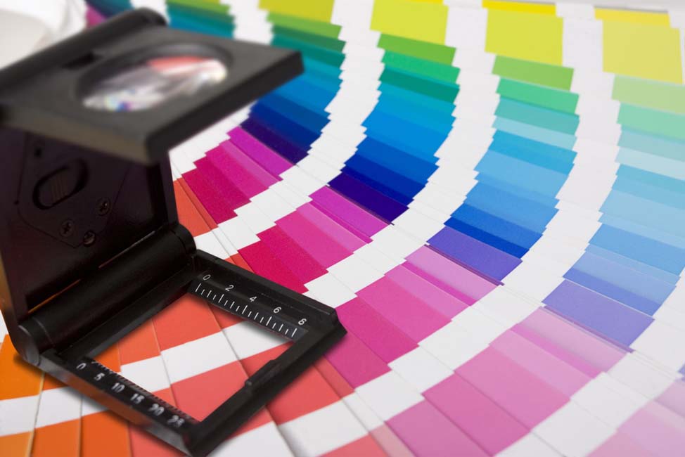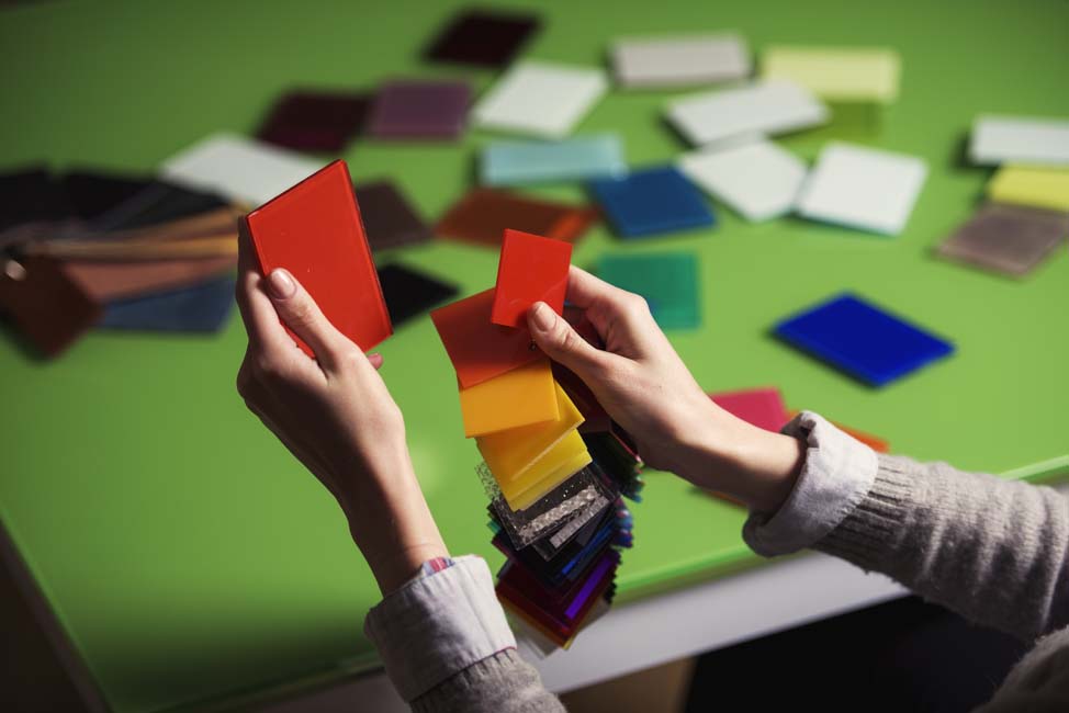
Pantone Company
Pantone was originally founded in 1962 with the purpose of providing color chips to cosmetic companies to match product. In 1963 it was purchased by a long-time employee, Lawrence Herbert who proceeded to develop the first universal color matching system.
The purpose behind the Pantone Color Matching System or PMS, is to allow designers to match colors for production regardless of the equipment they are produced on. Pantone was first adopted by graphic designers and printing houses and has since gone on to find a place in all industries where designs meet mass production, including textiles and hardgoods.

The Pantone Color Matching System
Pantone produces two standardized libraries of colors: The Pantone Graphics System and The Fashion, Home And Interiors System which includes segments for product design and fashion design.
Color Versus Time, Keeping Your Books Up To Date
Pantone recommends purchasing a fresh set of color chip books annually as their chips are known to yellow slightly over time, so if you are ever working with a production facility and getting an off match to the same pantone, older, damaged, sun faded, or yellowed books could be a factor. Sending a chip from your book to the production facility can be an easy fix for quick, one-time projects, but to ensure brand integrity over time (think Tiffany Blue or Starbuck’s Green) it’s important to keep an updated and accurate set of chips.
When designing with the pantone color libraries, it’s important to understand your final production method as this will inform what colors can and cannot be reproduced.
-
CMYK
Most printing is done in CMYK, a 4 color process printing method in which colors are produced by mixing Cyan, Magenta, Yellow and Black. Many of Pantone’s colors are beyond the spectrum of what can be produced by CMYK process print. CMYK compliant colors are noted as such on the pantone color chips.
-
SPOT COLOR
Spot colors are produced by pre-mixed inks and are inherently more flexible when it comes to matching the entire range of the pantone library. Screen printing is done with spot color inks for a variety of substrates and is the most commonly used form of decoration for primary packaging. Spot colors produce even-toned, crisp colors, as opposed to the version produced by mixing CMYK inks - this makes them more advantageous for printing brand colors and logos.
In some cases CMYK can be combined with Spot Colors. Some printers also offer 6 or 8 color process printing to reach a wider color range.

Color Versus Interpretation, Getting The Right Match
Pantone colors can be matched by the human eye, but it’s important to reduce factors that can skew the results:
-
Lighting - Make sure you are viewing color in a controlled, evenly lit environment. Color can and will appear differently under different lights. Daylight is the best light to match color in. You can create a more consistent environment similar to daylight with a full spectrum light booth or full spectrum lamp.
-
Background – It’s important to match color on a consistent, neutral background, typically plain white is best. Viewing color chips on top of a bright, busy or inconsistent background can play tricks on the eye and make color matching difficult.
-
Color Acuity – Many people see color differently, and there are many degrees of color blindness. Even people who believe they see all colors normally can have issues distinguishing minute differences in certain color ranges. The best way to test your color acuity is by taking a color acuity test.

The Farnsworth-Munsell 100 Hue Test
Long considered the standard in color acuity testing, the Farnsworth-Munsell test is often used to test color blindness. It was originally developed as a physical test kit with tiles in minutely differing hues with constant value and chroma that the subject arranges in order of hue. The test is now most easily taken online. If you or any member of your team will be color matching consistently it’s important to know where potential blind spots (no pun intended) are.
Take The Color Acuity Test
Happy Matching!


