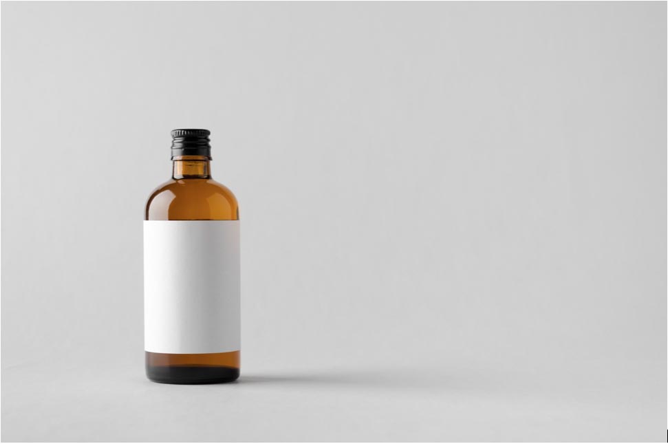
Eye-catching product labels are the public face of your company. They represent all of your hard work and everything your product stands for. From the first moment your consumer lays eyes on them to every repeat sale, your product label needs to speak to them clearly, appealingly and convincingly. Here’s how to make your label design a reality:
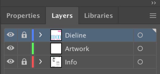
- 1) Open Adobe Illustrator and set up your artboard. Create Layers For Dieline, Artwork, and Information
- 2) Add some guide lines to the dieline layer to show the boundaries of your panels. For example, you might wish to center your artwork on the front and back of your container. This would require two vertical guide lines equally spaced from left to right to note the front and back center lines.
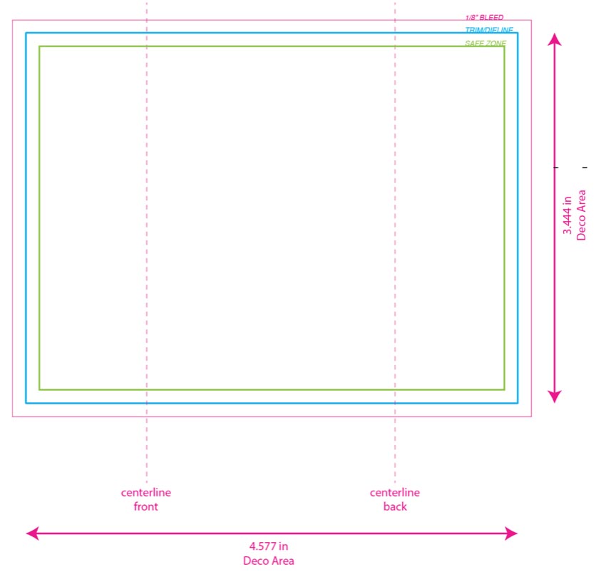
- 3) Add die lines to your dieline layer. These lines are the “blueprint” for precisely how you want your label to be cut. At the very least, die lines follow the path of the trim lines. However, you may wish to have rounded corners instead of square corners. The die lines indicate exactly the path of the edge of the finished label. Die lines are also used to indicate the placement of other interesting label elements such as windows, slits or interesting shapes.
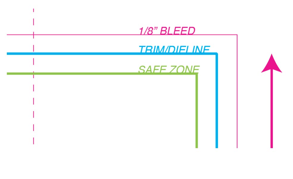
- 4) Add a safe zone: lines along all the exterior edges of the label 1/8” INSIDE the trim lines or dielines. Keeping your information confined to within the safe zone lines will ensure that trim dies (the machinery that cuts out your label) will not crop any critical information
- 5) Make sure to include a 1/8” bleed on all sides of your label. Bleeds are the amount of ink that extends beyond the edges of the label. The bleed line is outside the trim line. The trim line is where the label will be cut. Bleed lines are important because without them, you cannot ensure that your label will have edge to edge coverage. Planning for a tiny bit of extra ink coverage costs virtually nothing and can mean the difference between a nice edge-to-edge laydown of your favorite color or nasty white streaks along two edges.
- 6) Save your new label early and often as you are working. We recommend every 15 minutes or after any major changes.
- 7) Now that the internal and external parameters and perimeters of your label have been established, it’s time to design on your artwork layer! Your label needs to sell both convincingly and appropriately. Making your product noticeable and enticing with engaging copy and graphics will help put you at the forefront of the consumers mind. The front panel is the most important part of your label. It is the what consumers notice first. The front panel promotes, educates and persuades your potential buyer to pick it up. Typical front panel elements include your company logo, your product’s name and graphics, a description of the contents of the package and the capacity of the container.
- 8) Next: the back panel. Depending on your product, there will be labeling regulations that must be followed. It is your responsibility to conform to all industry-applicable regulatory agency requirements. This may mean an ingredient listing, nutritional information, warnings, and barcode depending on your product. Your back panel is a perfect place for sales copy, directions, product statements and company contact information that might include website info, e-mail addresses and consumer relations numbers. You should always research what you’re required to include.
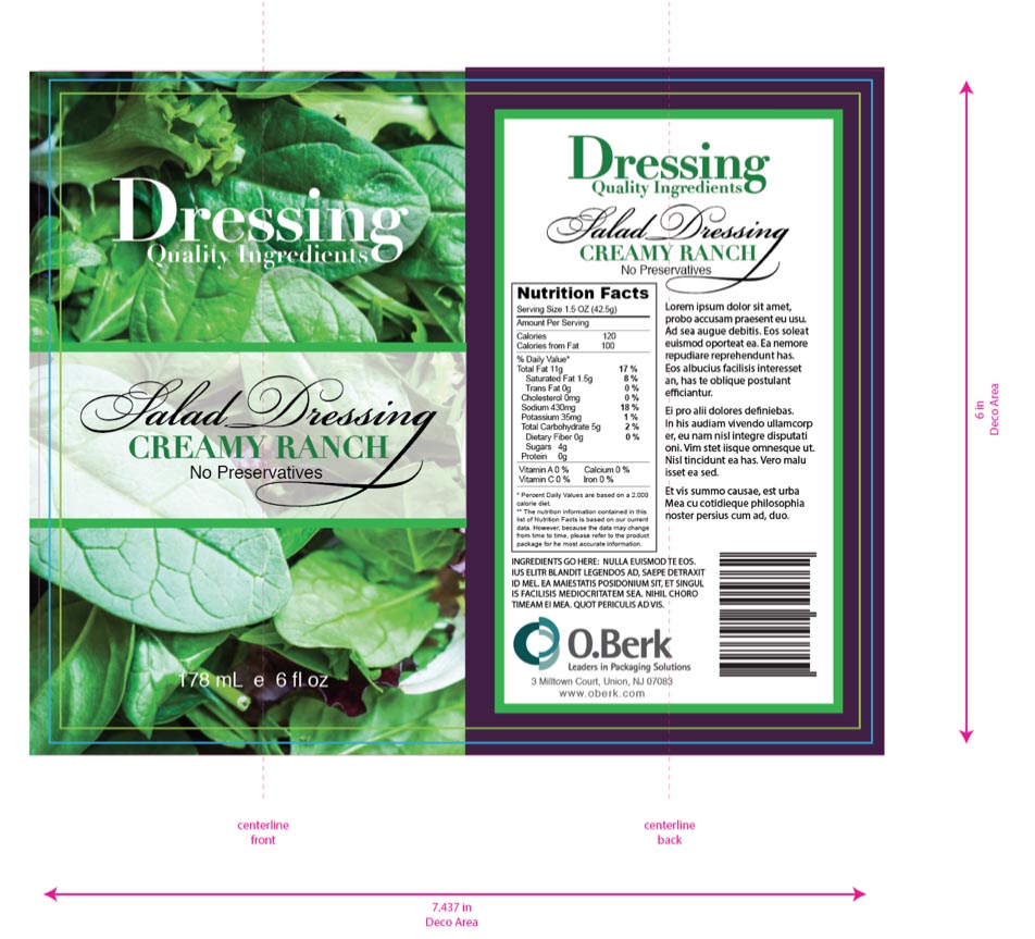
- 9) Spec your artwork on the information layer. You should always include a title block with the following info:
- 1) Company Name
- 2) Date the artwork was created
- 3) Date the artwork was revised (if applicable)
- 4) Syle No. Of the Poduct Being Produced
- 5) Color printing specs (Is this a CMYK print? Matte/Glossy? Any spot colors? Special effects like metallic accents?
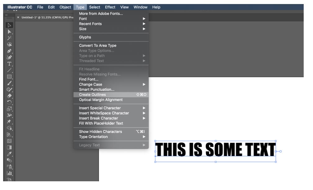
- 10) Highlight all the text in your label artwork and go to Type – Create Outlines. This will outline the text in your document to ensure when your printer opens it, they will see the same fonts. Save your file again with the ending “Outlined”.
- 11) Save your new outlined label file in both .ai and .pdf versions. This way you have a proof version that can be opened by people on your team without Adobe Illustrator, as well as a print ready file to send to your printer.
- 12) Make a prototype and see how you feel about your work. Print, trim and affix your artwork to your container or closure. If it looks great, wraps well and is spaced correctly, send it off! A tip: Once you’re happy, put it away for an hour... a day... even a week depending on what kind of time you have. Then, look at it again with a fresh and renewed perspective. Pass it around your team to sign off on copy edits and typos. That’s what the pros do. Because once it’s printed... it’s done!


